
OBJECTIVES & GOAL
Provide an easy way for new & existing customers to move with Simply energy, integrate the experience into the billing system to remove back of house processing times and find a better way to communicate to the customer and manage expectations around progress and simplify the process to reduce frustrations and potential drop outs.
Role: UX/UI designer
Duration: 3 months Tool: Figma
My process
Roadmapping was introduced to me at the start of the project where design, strategy and innovation comes together. It creates a future vision, frame the time pacing and map the pathways towards it.
research
Competitor Landscape
During the research phase, we started with identifying who our direct and indirect competitors then analyse their content, marketing strategy and offers. Then evaluate competitor strengths, weaknesses and opportunities.
Our analysis helped us identify the trend and also the things we could potentially can look into. That included mover offers, guarantees, calling out how easy it is, stressless move, the time frame & trackers.
Communications Audit
SMS

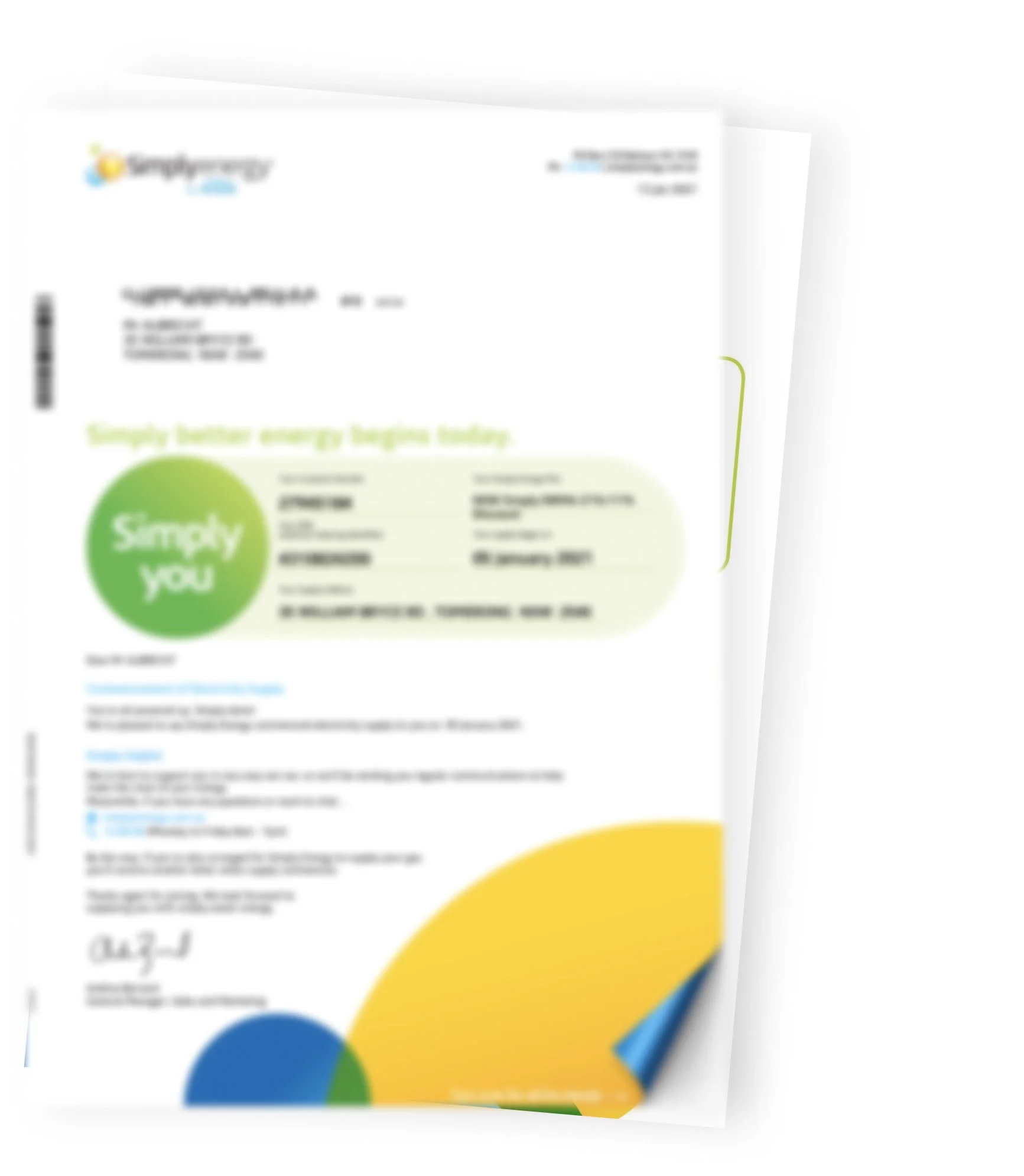
Welcome Pack
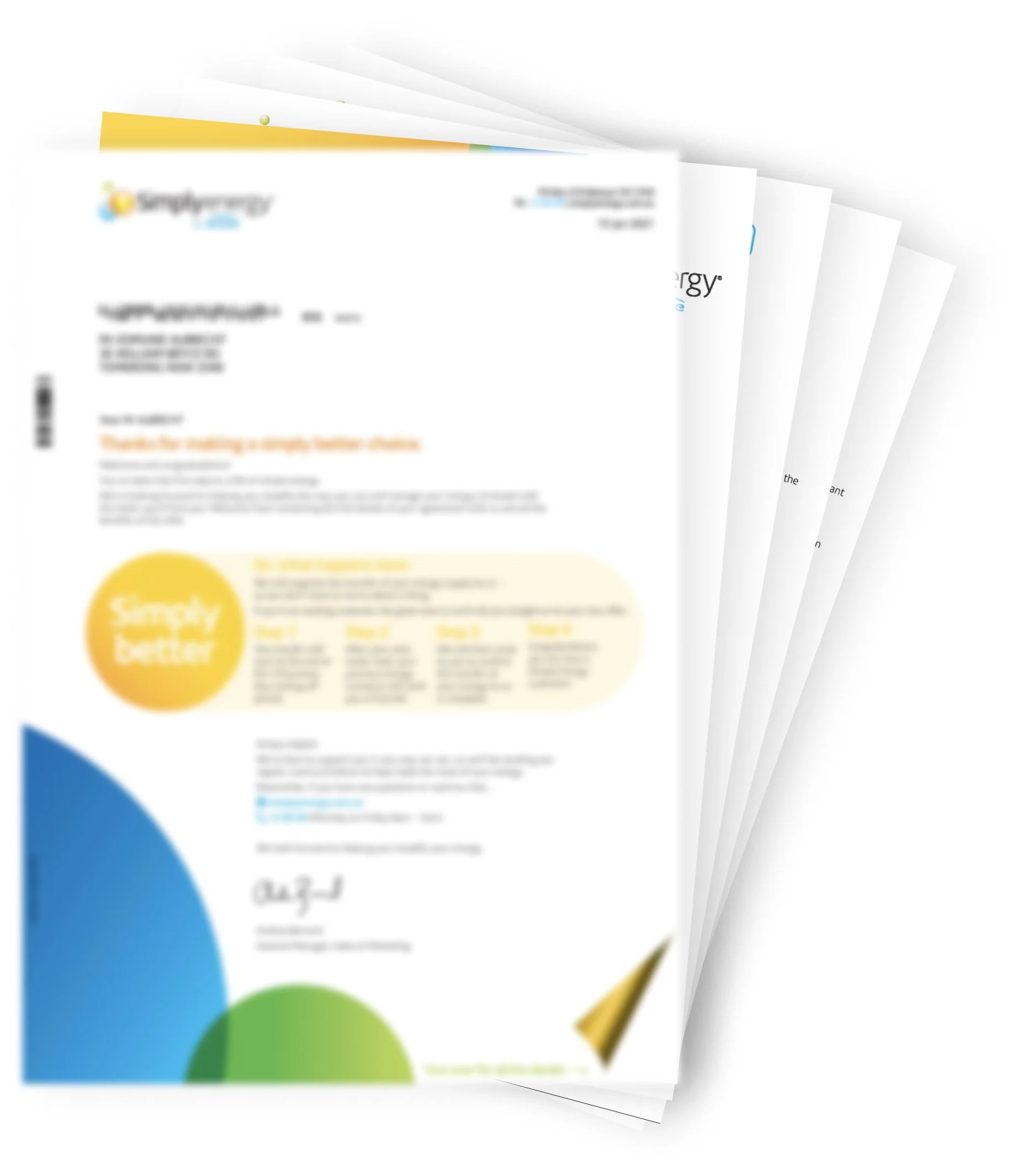
Commencement Letter
Next, we moved onto assessing the current Simply’s communication method so we can determine how effective it is and this included the digital and printed content. From our evaluation we questioned whether we convey the right information? Did we convey the right message? and was it the right medium used?
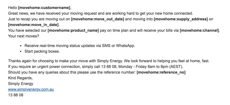
The opportunities we recommended includes, personalisation, it is something customers widely anticipates in any form of communication. SMS confirmation can have numerous benefits such as more effective opening rate and also handy to have an easy quicker access to relevant info in your pocket so it is vital instead of a generic message, the content needed to include a brief summary like their name, connecting suburb, expected timeframe, reference number and how to get more info and how to contact us. As for welcome pack & commencement letter, both needed to add personalisation and more context as to how the two letters differ from each other, and have an acknowledgement that it is a move.
Current Moving Experience
Next, we prototyped the current moving experience and tested the functionality of the website for new & existing customers along with the competitors. It gave us the opportunity to observe the users behaviour, what are their pain points & where in the journey that may have caused them to want to drop out. In the interviews, we’ve also included general moving questions so we can dive a little deeper into the movers mind frame so we can design with that in mind, how we can make it simpler to alleviate the stress of moving. Below is the experience map I’ve created to show our findings.

“Moving can be physically and emotionally exhausting. Can’t say there’s anything fun about it.”
insights
From testing the customers, it was clear that moving is a busy and stressful time over a period of 2 - 3months. Whether that’s juggling family and/or renovation, the ever growing ‘to do’ list doesn’t make life easier. The movers are looking for a shortcut when they can so they can reduce the amount of choices they have to make.
What was clear to see in the experience map was the unsureness & frustration shown by the existing customers during the process. What is not shown in the experience map is that as a new customer, it’s a simple 5 step process, where as an exisiting customer, you are going through double the amount of steps. The unnecessary complexity of the process, the amount of info that needed to be filled that should have been pre-filled, it makes the customer question whether they should move to another provider, because signing up is faster.
By the end of the request, the uncertainty of what’s next was also expressed when they received an SMS which the content was too generic & vague.
Existing customer moving
Should be an easy change of address and starting point in myaccount
Choosing to stay because it’s one less form / choice i have to do
(*) Assumed they’d be sticking to the same plan
Left feeling frustrated and questioning whether it’d be easier to join elsewhere
New customer moving
Don’t consider as moving, just looking to sign up
Looking for specific info, IE. rates, solar, kw/h, stance on environment perks
Form is simple
Expected more personalised and contextual communications post sign up
Ideate
I started mocking up as many ideas after gaining user insights from research/observation and then went into a productive ideation session to conjure ideas, challenge it and find new angles / perspectives from others to tackle what’s the best design solutions. Below are some of the concepts shown.
Concept 1 - Quick win aim was to turn the current three part form into a unified checkout.
Concept 2 - Medium win

Concept 3 - Big win (more creative exploration)

New feature ideas
With my creative exploration a few ideas were roughly mocked up to address some of the opportunities from the experience mapping.

Whatsapp integration

One click. Within MyAccount, Emphasising this quick 1,2 step approach

Track my move feature where customers are up to date with the progress
Prototype testing
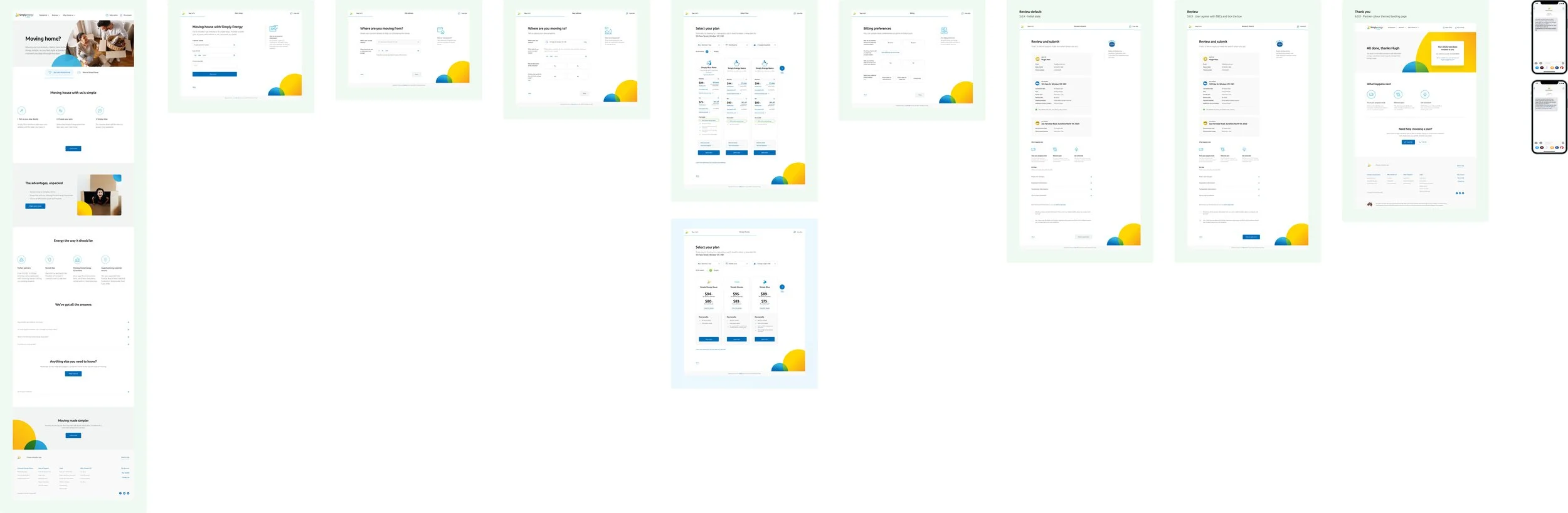
We prototyped the updated design with the same people to see whether we’ve addressed the insights and improved their experience. The test revealed we achieved the reduce need for MyAccount, no confusion regarding why the need to fill forms and then having to choose a plan, the customers were really happy with length and ease. It not only meets assumed expectations of moving experience with current provider, it also the validation felt like logging in. Once we’ve made minor copy tweaks, added additional tooltips, made changes to the summary page CTAs, it was then ready for legal and regs op to review and confirm the requirements.
comms
The next important step was mapping out the comms. From the data collected, the majority wanted to know the progress and at what stage they expect to hear from Simply. We carefully architected the when from the moment they submitted the application to the new place being connected so it won’t be overwhelming but transparent enough to satisfy their needs and expectations.

New features
Track my move is the new feature that was introduced to allow the customer to stay in the loop and be able to track the request from the moment they sent off the application online to when their energy is connected. The track my move allows users to check progress at their own convenience. It contains connection details and it can be accessed by a link or by logging into MyAccount to view the status.
Progress Bar Exploration


Animations


Below are some mockups to show how the new feature would adapt into the full journey.

Comms
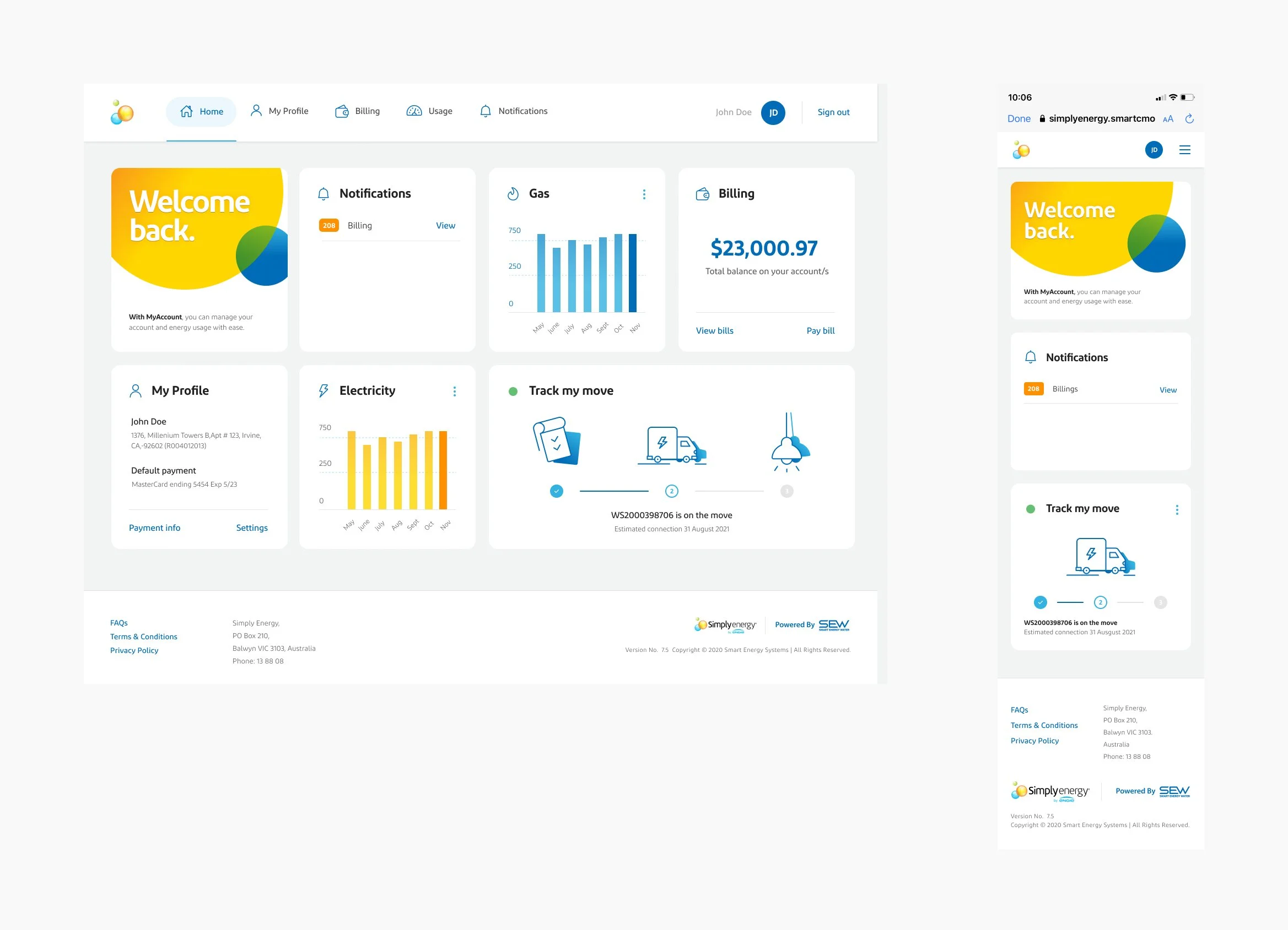
MyAccount Dashboard Screens