objectives & goal
A side-project I created focusing on primarily on composition, visual design principles and UI. The goal to create a location-based dog walking website that allows dog owners to select walkers in their area and schedule them to walk their dogs.
Duration: 6 weeks Tool used: Figma
background
Fetch is looking to expand on the UX research that has been conducted and complete the UI (user interface) design of their website. As a UX team, they’ve researched the market need for a location-based dog walking website that allows dog owners to select walkers in their area and schedule them to walk their dogs. The following tasks were completed to validate the attached wireframes: Desk Research, User Interviews, Ideation, Concept Design, Low Fidelity Wireframing & User Testing.


user testing insights
Top 3 selected insights were discovered from the first round of user testing.
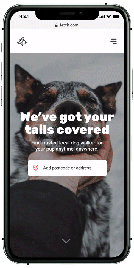
1. Participants missed the ‘Dog walkers in your area’ feature on the landing page. If this was made more prominent, they would be more likely to browse.
a. ‘Oh, I totally missed that part.’
b. ‘I see, I didn’t see this at first. I would like to browse at first and get a good idea of how the website works.’
c. ‘I like this feature, but it isn’t obvious.’
2. ‘Ratings’ is a missing element on the list page. This would help the users to build trust with the walkers.
a. ‘I’d really like to see ratings here. That would contribute to me making a decision.’
b. ‘A star rating would be great. I don’t really have an idea how good the walkers are without it.’
c. ‘I always look for ratings before I hire.’
3. Participants were unable to ‘search’ for help queries on the help page. This will help them get more specific help.
a. ‘What happens when I have a question that isn’t addressed here? Do I have to send an email? That would be annoying.’
b. ‘There aren’t many answers on this page. I bet people will have more questions than this.’
c. ‘Is there a way for me to search? I find that function really helpful.’
my approach
To begin the next iteration, I designed this moodboard to feel clean, expressive, friendly, beautiful and fun. Given that our user is new to the site and wants some help getting started, by using vibrant, contrasting complimentary colours, rounded edges and a combination of illustrations and powerful thought provoking photographs that captures ‘moments’ helps make Fetch approachable with a sense of ease.


For the UI flow, I mapped out all routes that a user might take through my website in order to achieve the goal of finding a dog walker anytime, anywhere. The route starts at the homepage and covers all the steps the user might or must take in order to book a walk.
Various UI elements have been created in order to create a cohesive product image. Rounded corners, simple subtle animated icons, card like pop up effects are just some of the few elements considered and carefully planned out to compliment and encourages action.

page design
Below is the responsive design that I’ve created which means the way it’s put together it can automatically scales its content and elements to match the screen size on which it is viewed. This is where I begin applying the component library information into these pages so it can create a cohesive design. Each component plays a huge part in offering a much better experience for the user which essentially help inspire them to keep browsing and get closer to booking a walk.

Design rationale
The key aim of design is to offer pet parents who needs more flexibility to manage everyday life whether that’s a busy parent or a working professional. To deliver, I wanted to create an engaging, mobile friendly design that my audience can access whenever they want, wherever they roam.
Starting with the user flow, determining how all the possible routes a user might take in order to get to booking a walk and what might be the obstacles along the way and the pain points. I then started focusing on the visual hierarchy, the volume of information, the Z-pattern of eye scanning, ordering their importance so that users can easily scan page information needed quickly, click and book a walk smoothly.
The first thing I wanted to focus on was refining the search field so making sure it’s asking the most relevant information, taking all the obstacles, pain points into consideration so the user can get more filtered results and get them one step closer to finding the right walker. Secondly, I looked into the layouts, the content and the order. Something like the homepage where it needed to be informative and eye-catching, the hero image was added to the fresh, clean design to express personality so it can trigger user emotions. I decided to include animated illustration/icons so it helps create visual triggers as vast majority of people perceive images faster than words and knowing a strong visual can provide effective support to the copy applied on the pages.