
Project background
UniSuper is one of Australia's award-winning superannuation funds with more than 620,000 members and $115 billion in funds under management. For 40 years, UniSuper was only open to those in the higher education and research sector. Now anyone can join the fund that offers greater super.
OBJECTIVES & GOAL
Now that anyone can join the fund and you no longer have to be working in the higher education or research sector, this means it will have a higher demand for a native mobile app as it means the potential to attract a broader age-ranging member base. My goal for the native app release is to make sure the brand story continues via app. Pursue the twin goals of building functionality and building knowledge through design brand elements, trends and patterns then turn the design into prototype to be tested while simultaneously thinking about the next feature (or two) to be built.
Role: Senior UI designer
Core Delivery Team: Channel Owner, Senior Experience Designer, Senior Service Designer, Senior Design Researcher & Senior User Interface Designer (Myself)
Duration: 5 months Tool: Figma
MY PROCESS
My main focus for this job was to support the core team in the App design sprints in the user interface space. My role was to be the bridge between user needs and business outcomes. I help to gather requirements and develop designs for the planned features within the sprints that work in tandem with wireframes; I also provide feedback on these decisions through design & prototypes (including interactive ones).
With the time-boxed conditions, I like starting the sprint with asking the team members the current user needs, any changing circumstances and obstacles that’s presented itself so far to have a better understanding. Then I familiarised myself with branding across all platforms to make sure i design with the mindset of continuing the brand story. As you will see below, we pulled together collaboration, ideation, prototyping, and testing into an accelerated process that produces fast answers to crucial product and business questions to meet the brief for MVP.

Testing single & multi account user login flow
App user testing was conducted with 19 participants to inform the design of navigational elements and the content. For Single Account Holders, the key insights were whilst many understood the relevance of having Accounts for multi-account holders, there was a strong preference amongst single accumulation account holders to be presented with Overview rather than seeing the multi account screen.
Splash screen – Since this fleeting moment screen appearance is the user’s very first experience with the app, I designed it with the logo with the brand background element with micro animation in mind to build brand awareness, perception and to make a great first impression.
Accounts screen – I wanted to make sure there’s a colour distinction between different types of account. With ideation, I’ve explored using primary & secondary colour cards, although it looked nice but for visually impaired users, they might struggle to read some of the fonts/colours especially if there are more coloured stacked cards. The Icons were added in to pair with each account as it improves visual interest and grab the user's attention. By stripping out the vibrant background colour on cards, the simplicity of the design and the clean, uncluttered layout was highly commended.

Tooltip UI Modal
Overview screen – I wanted to design in a way that it’s clear, interactive, and user-friendly. With the previous research being done and we know what were the highly desired features, I wanted to bring in design elements that can communicate information at a glance through efficient data visualisations. That way, it will enable users to extract actionable insights, identify trends and patterns. With progressively ideating, critiquing and fine-tuning, accentuating the most relevant piece of information was the key. For example, the big balance, which the participants liked that it’s ‘straight-up’ with the effective date. Balance over time – by choosing the right chart type to present our data and the use of primary blue, it conveys comparison.
Tooltip UI – Superannuation can be tricky to understand especially with its own jargons so with potential younger members joining we’ve introduced tooltip modal. A modal was chosen with the purpose of housing the additional information about the section they are questioning about, it not only gives more clarity but can also further educate members when needed.

Investment flow
Investments allocation screen – Members wanted to be able to track their investment allocations. As I begin concepting, I had to be mindful about how to express how members manage their investment across different funds. A coherent design was extremely important, that way it enables users to easily process information. I wanted to create a hierarchy of data at various data in a relevant way for decision makers hence why I emphasised the option breakdown value within the pie chart. Even the colours used, we kept the already assigned colours to each fund for familiarity & consistency.

Testing Investment allocation charts
When tested, the users favourably responded to the pie charts but didn’t feel the interactive option was essential as the supporting small pie charts below were sufficient. However, some members struggled to interpret it when only a single option was allocated, so there’s always room to improve in this space.
"Yaaaah now we're are talking - I like this it's good -
shows it all very nicely in one snapshot.”
–
"In terms of informational purposes they are both equal
with or without the big circle - but from a visual perspective
I prefer having the big circle."

Testing Investment performance charts
Investments performance screen – This is one of the most requested features from members wanting to be able to track their performance. Line chart was a good idea because we are showing continuous data change over time & prediction. When working on data visualisation, had to be mindful that we were designing for diverse ages, not be tempted to focus on a WOW effect and overcomplicating it. We tested both static & interactive scrubbable charts similar to some weather apps. Like above, the data are displayed inline with the colour associated to the individual fund.
"I prefer the other one static because I can see the numbers without me moving it and I can get the picture of what's going on easier. Moving is cool but no value for me."
–
"I feel like it's [interactive] adding a whole other level
of complexity for me."

Transaction feature flow
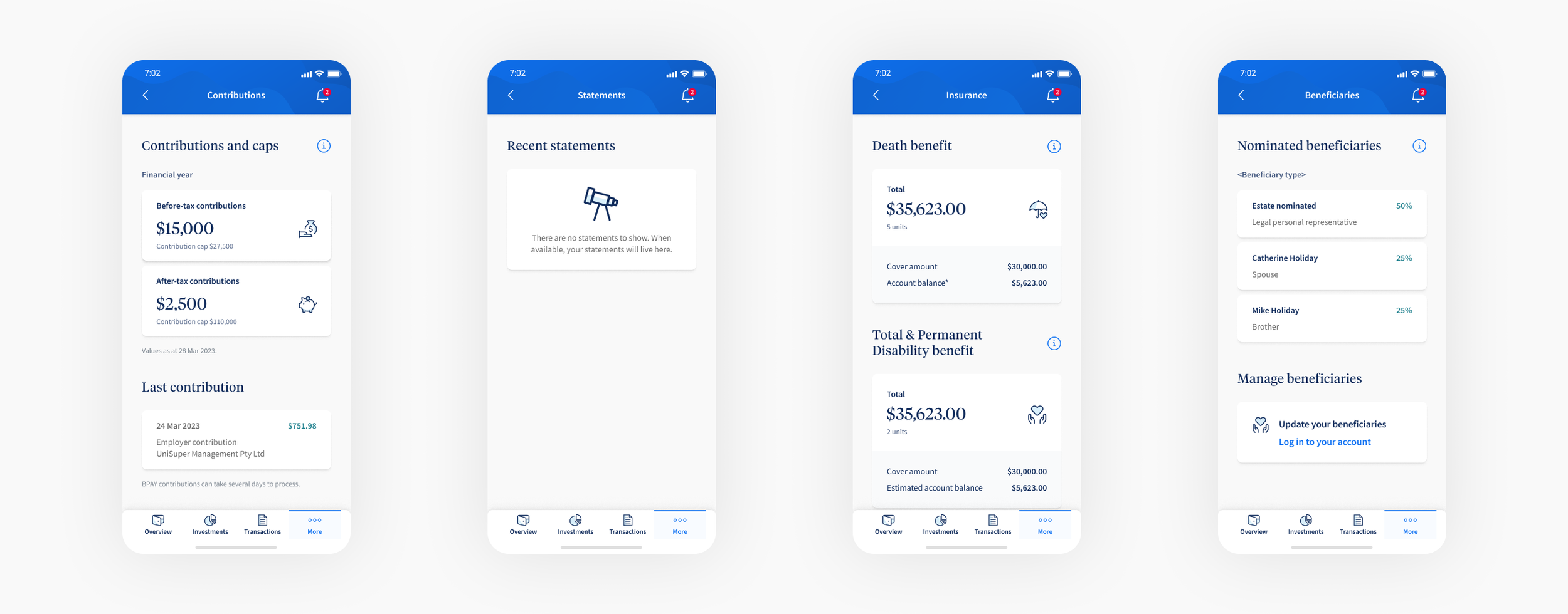
Contributions | Statements | Insurance | Beneficiaries

More navigation flow
opportunities
Product exclusion was a key challenge. Different age group level of interest, low financial literacy and smaller account balances may feel marginalised with generalised example balances as well as information with its terms & jargons. The user testing supports this.
We tapped into heuristic insights to reframe challenges into opportunities and promote positive financial habits. I proposed more targeted interactions, changing of the tone of voice basing off of geo-demographic segments as different life stages and affluences changes the conversation as well as expectations.
Not only did we achieve the desired results in a short period, there are further designs created for the future launch too.

Onboarding

What’s new? – New features

Tip guide

Investment cards – Supporting content

Sustainability card