“Since its foundation on 3 June 1765,
Lloyds Bank has been serving the households,
businesses and communities of Britain”
THE PROJECT
Lloyds Banking Group has many household names like Lloyds Bank, Halifax, Bank of Scotland and Scottish Widows. Being an account holder myself with Lloyds, I want to tackle some of the painpoints/frustrations I personally experienced so it can be more intuitive and allows me to get things done faster.
Role: Visual Designer Tools: Figma
the challenge
To make the app easy to use and to personalise it more to make an emotional connection with the customer.
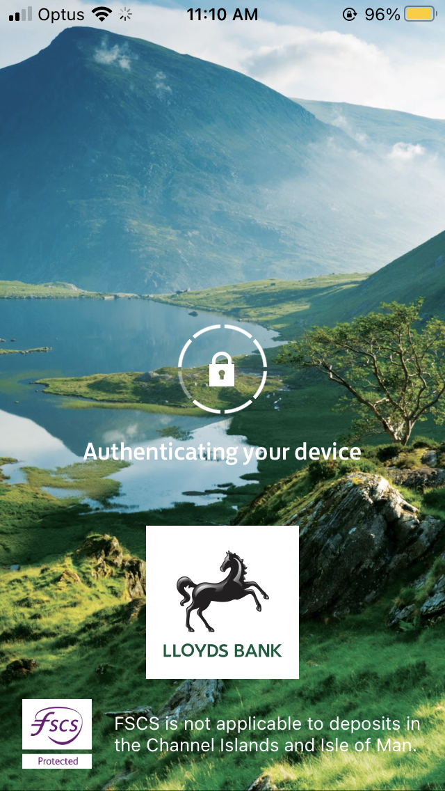
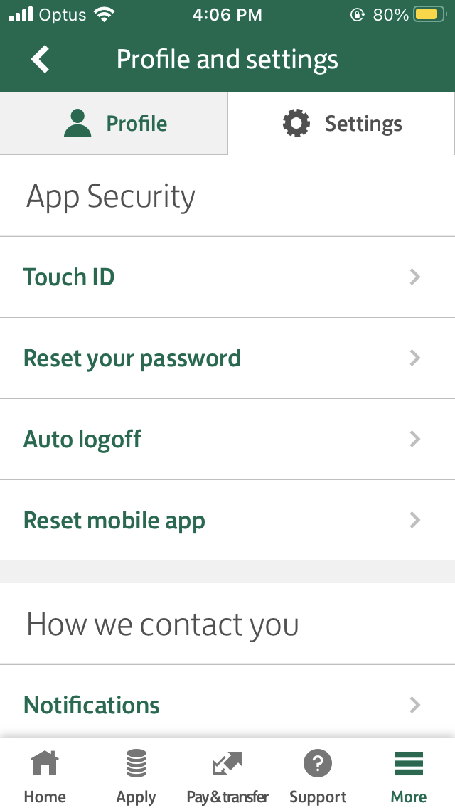
Current app


New design
The visual design below focuses on improving the user journey & experience starting with refreshing the look & feel first then tackling some functionality so it cuts down the numbers of taps. My goal is to making changes where it can be more intuitive so it needs minimum explanation. Mobile banking apps are often data heavy, finding different UI elements to break up the content, helps improve readability which means easier to digest. By keeping it simpler & consistent, the UI cards used across different screens achieves that declutter look. I then introduced outline icons to lighten up screens as when used as visuals, subtle animation or infographics it catches the users attention more & easier to understand the context without being too wordy. Overall, it saves time and improves usability.

Loading state -
Animated horse running
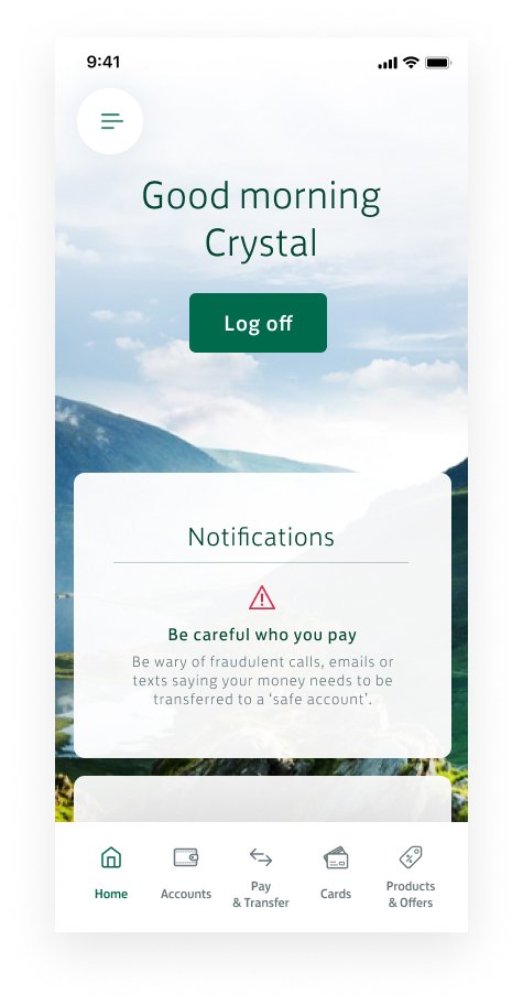
Personalise home screen -
A dashboard where you can customise and have your most important notification displayed on the top level including new features/alerts from the bank.
Bottom nav -
Allows common/known features, including products & offers. This encourages movement between primary destinations.
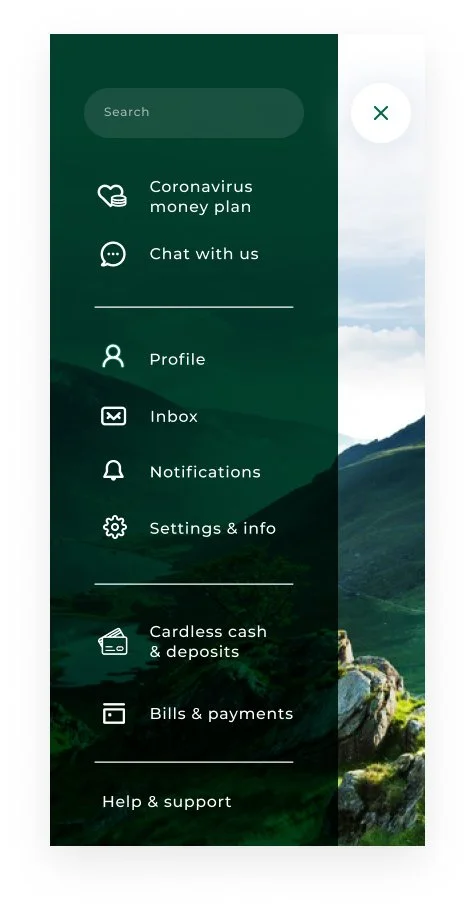
Hidden side menu -
Slides in when you tap on the hamburger icon

Visible and swipeable account cards -
The cards help declutter and allows the user to check the most important information first, their main primary account and their balance.

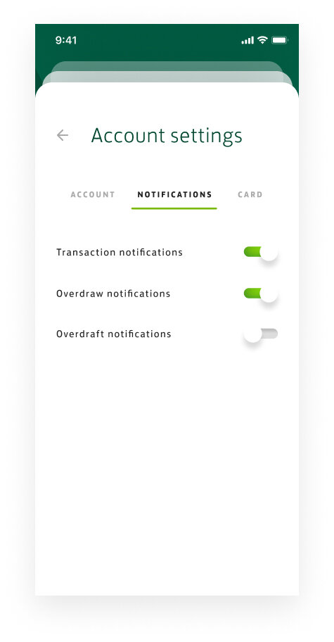
Account settings -
Grouped them in tab sets to break down the amount of content


Account details -
Each bank account have a brief summary.
View transaction -
After user taps on the view transaction CTA, the content slides up.
Each transaction are paired with categorised icon

See my spending -
When you tap ‘See my spending’ it will display your current account breakdown. Scroll horizontally to see other accounts breakdown if you choose to.
Pop up toolkit will guide the user that the slider can scroll horizontally to see different months.

Scroll up -
As you scroll, you’ll see your spendings in categories. You also have the option to check out other months.

Cont -
At the bottom of the screen, you’ll see 3 CTA’s where it takes you either to see your income, spending or savings.