LIGHT THE WAY ‘EVOLUTION’
Digital first approach is essential for the third largest retailer in Australia, EnergyAustralia. To succeed long into the future,
it is critical that EnergyAustralia prioritise optimising their customers’ experience and enhance business outcomes across multiple channels, connecting crucial dots between people & information.
The challenge
EnergyAustralia’s logo is their most recognisable and valuable brand element. Not only is it important to retain the brand’s personality, but a brand mark must also be flexible in its design to communicate across all different media and devices. The refreshed identity with the expanded graphic language went through many iterations to reach the final product.
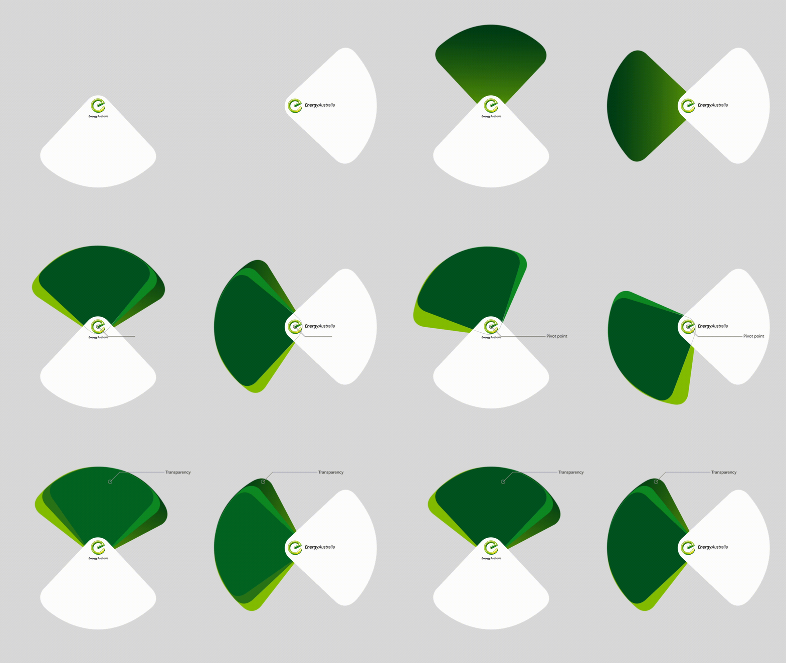
The Spotlight device became a key part of the new visual identity. With the key elements, it was vital for me to try & test what works & what doesn’t across all platforms and one discovery was, where possible to add movement to the spotlight so it can bring it to life around the messaging. This is a visual language that EnergyAustralia can own and help strengthen brand awareness.
tv commercial
Although the impact has shifted, TV is still the medium that represents the largest potential audience and can help brands extend reach in a targeted fashion and in a way that consumers know and trust. But it's critical that they have viewing data to inform marketing efforts, including how to best reach specific targets in today's fragmented TV landscape.
With the refreshed version below, it shows how the Spotlight can adapt easily across devices, media and platforms. The Spotlight guides the audience’s eye to an important message and It can also act as a transitional tool from one frame to another and with the subtle movement of the Spotlights, it adds an illusion of life.
With the new flexible design, it can easily be adapted to the consumer journey (Awareness, Consideration & Decision). Through the design process, I discovered consumers are frequently driven by emotions rather than information to make brand decisions so I designed for flexible functions.
With the first oOH example (left), the spotlight device allows a way to artfully add an image, an animated image or a video to deliver an emotional connection by using story telling approach. The second oOH example (right) with the green gradient background is a more stripped down version where you focus more on the copy, best for conversion/retail messaging.
Iconography
Updating the iconography is a tactical manoeuvre to unify the set to the new visual identity. By creating a consistent style, I started by adding a little personality and rounded all the corners to make them feel more comfortable and less stuffy or rigid.
display banners
There are two types. ‘Dynamic’ which refers to the adaptability of your advertising. Each banner ad can be tailored depending upon geolocation, behavioural, demographic as well as much more so best use for conversion. ‘Bespoke’ meaning it’s uniquely created or custom a certain purpose, so best use for awareness or one-off campaigns.
Below shows where the banners live. If the banners are to be served alongside each other, the copy and design should be tailored to work together and deliver a more impactful message instead of the one copy fits all approach.
Social media
Since social media is “where it’s at” these days, update to facebook/instagram was inevitable. It is a good way for engaging and interacting with customers. The more you communicate with the audience, the more chances you have of conversion. To help the social content perform the best it can, the first issue i addressed was the amount of information on a static post. When information overload occurs, it is likely that a reduction in decision quality will occur.
‘Images with less than 20% of text outperform text-heavy images’
When it’s a static post, our recommendation is to keep the descriptive message in the post copy under 120 characters, it’s best to keep the post copy short and sweet. If you’re placing text on an image, keep it short, you don’t have much room for niceties.
EDM
Consumers have come to demand and expect relevant and personalised content and experience, both online and offline. It was important to design a modular layout so each brand element can combine and co-exist and responsively adapt across different screen sizes (desktop, tablet and mobile). The design follows an information structure that uses a 12 column grid system and a visual F-pattern.


