OBJECTIVES & GOAL
The current provided design (See below) needed additional design investment to ensure the new Hallmark website delivers on brand and engages its audience in a memorable way. Hallmark wanted us to modernise the overall design style (Prioritise pages - Home page, Product category, Product sub category, Product detail)
Duration: 1 week Tool used: Figma

Process
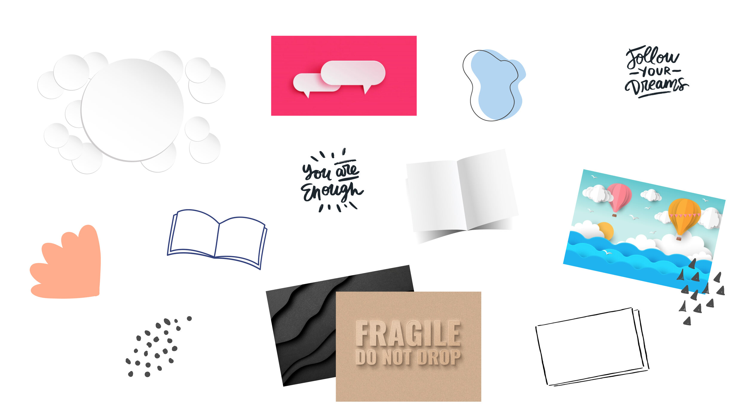
After doing research I started creating a visual mood board that have the elements that are related to their brand and what they present, a company that helps you live a caring, connected life full of meaningful moments.
page design
Based on agreeing to keep the already developed page structure, I created 2 concepts that uses already made components, reintroduced other colours from their colour palette & adding new elements to support the content of the page/brand. The colours chosen, complements their primary purple and it gives off that warm connection. It also breaks up the intensity of the purple used so it’s cleaner and allows the user to digest the page more easily.

This concept stays more closer to the structure already developed but by adding additional elements to the page, it helps mimic the real-world of the different kinds of paper styles - from stacking to open cards, embossing to torn paper edges.
Because the brand is about meaningful moments, for the hero section, using cinemagraph treatment will capture and hold people’s attention. The treatment disguises the photo and surprises the viewer when they come to life with hints of motion.

This concept steps outside the guidelines by using bold colours from their colour palette instead of their normal use of only their primary purple.
Hero image uses cinemagraph treatment.
The layout is inspired by the stacking of cards on a shelf, paper cut outs as flourish (like pop up/crafty cards).
Micro animation helps viewer engages and welcomes users. It makes the website a bit more human. So as you scroll, subtle animations will animate as you reach the section. Modules like ‘celebrate those special moments’ (the clouds fold slightly moves), locate local store (the sign 'we are open’ swings) & subscribe for some inspiration (the stars on the string swings subtly).
variations
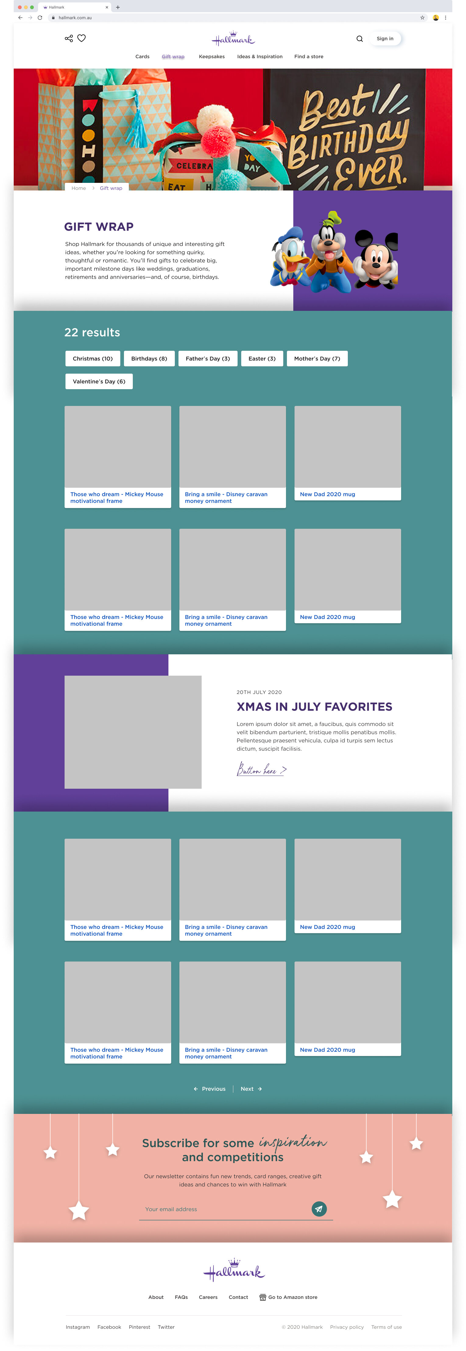
Product Category

Product Sub Category

Product Detail