OBJECTIVES & GOAL
Create an exciting place where educators can come to hone their digital skills and relieve their concern by offering videos and materials that they can utilise in day-to-day work.
My task is to design visual aspects with the users in mind, prioritising their interactions and experience over everything else. I ensure the user interface is as attractive looking and intuitive as it can be so that users can easily navigate the website and that includes interactions such as animation, implementing branding across all pages/templates.
Role: Senior Visual Designer
Duration: 1 month Tool: Figma
Research
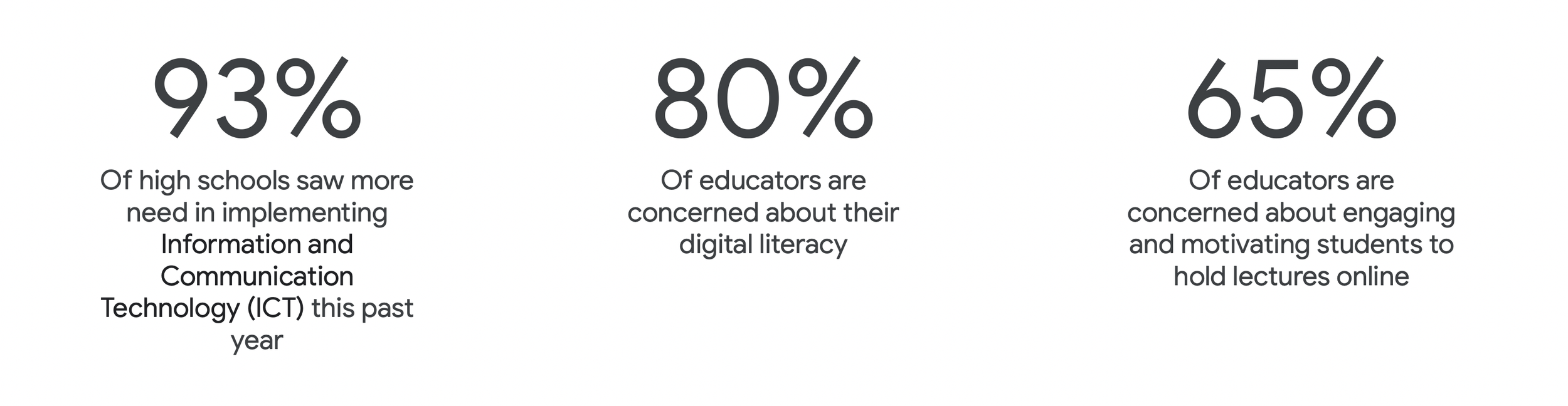
Data & Analytics
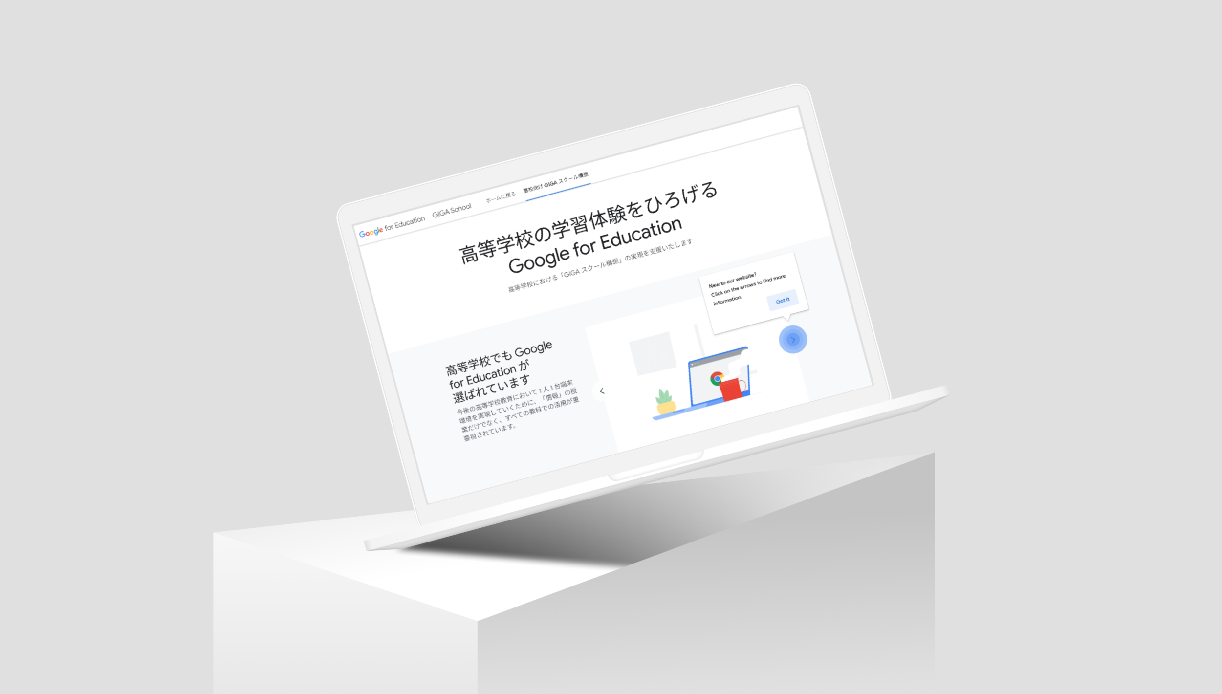
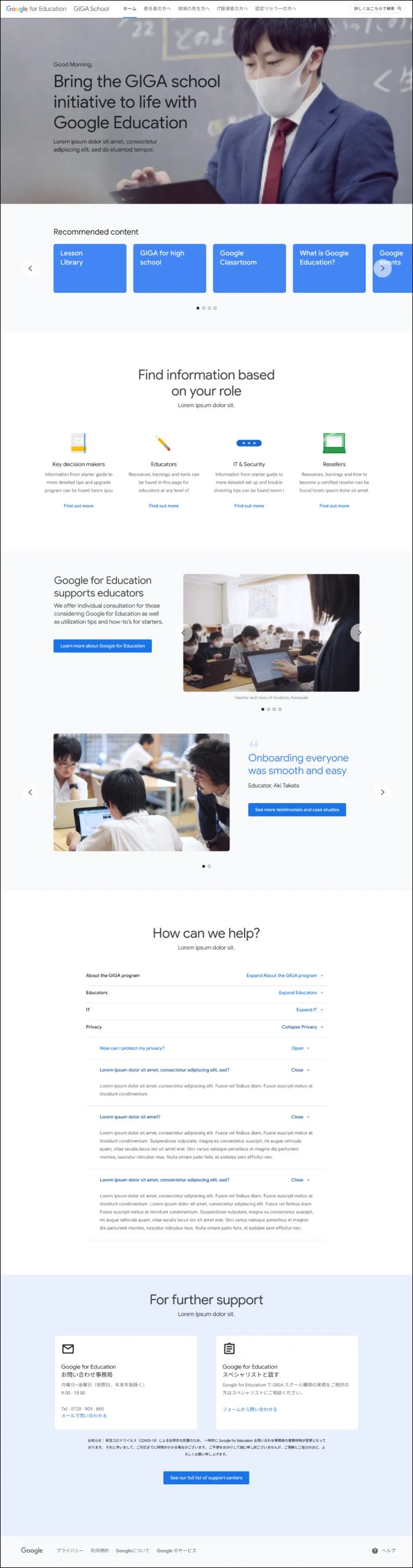
Current site
In a nutshell, the current site were not being intuitive, there were too much information to read through, requiring too many clicks in order to get to the actual content, the hierarchy needed to be re-looked at as it requires the users to scroll down to the middle of the page in order to find the section. Where there’s videos, it plays within the small tile, which makes it hard for users to see the information.
my process
With the understanding of the Japanese culture/market, I believe we needed to educate and boost their confidence with their digital literacy in mind. By creating a clearer hierarchy and dynamic information, by using conversational UI and visual cues throughout, tailor step by step experience, it can excite users with a tone of voice that creates a progressive journey. This can improve their experience and give the users the opportunity to see how digital tools can transform education.
“Google Education needs to migrate and build a proper stand-alone Google site. The site has to be optimized, updated, edited and maintained for the foreseeable future”.
Wireframes & Visuals
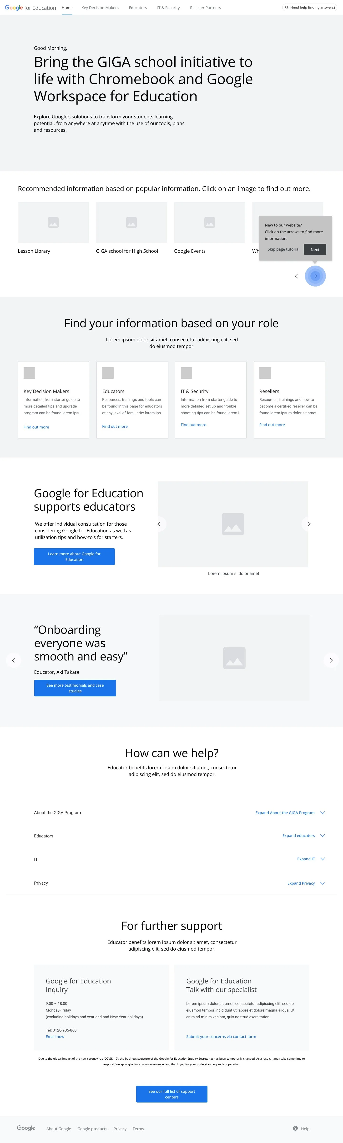
Below are the content recommended by the team on how the information should be detailed and voiced (technical tone). Upon first time arrival, users will be shown ‘tooltips’ that will hold helpful information and show them how to navigate the website. For the delivering phase, I was paired up with another fellow visual designer to work on the deliverables.
GIGA
Before I begin on the delivering phase, there was a few areas that popped up on the wireframes that i wanted some clarity, share my solutions and check if it’s feasible. I reached out to the UX designer to get a better understanding of the wireframes created and also the technology lead for technical questions I have.
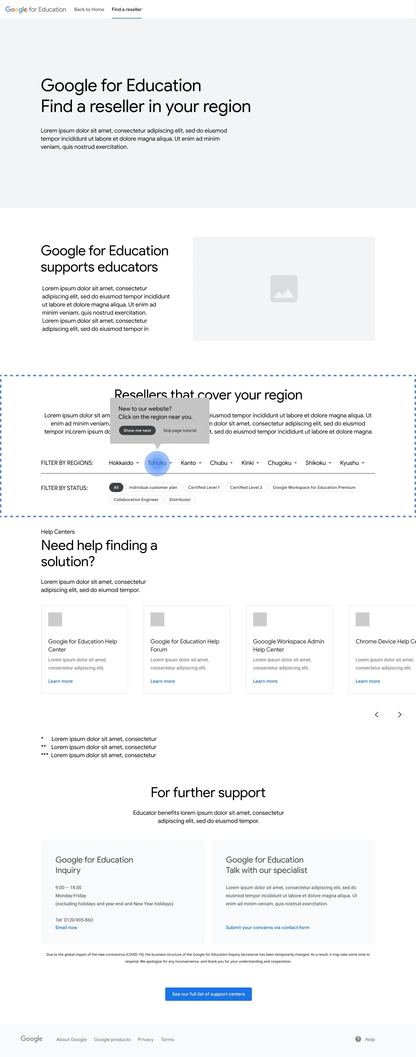
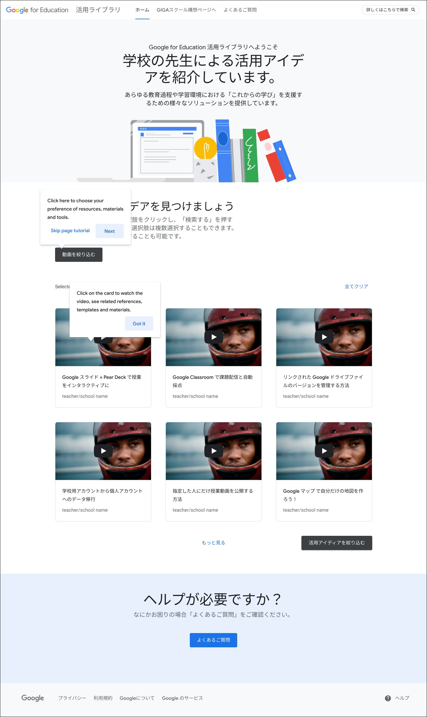
First thing I wanted to challenge on was the filter design as I felt there was room for improvement. Although we wanted to use already built components, given our users are not so digital savvy, we need to provide a more seamless experience where possible. By showing all options on display, that can very easily confuse them further. I proposed a version where we use the dropdown component to only showing the filter headers with a selection option. The idea is to remove or hide the rest so it allows the user to keep their attention in one place at a time and after you selected, the selected filter tag appears directly above the search results.
Secondly, I wanted to focus on amplifying the importance of scannability. There is often only a short period of time to impress a visitor with valuable content on-screen. By setting character counts for headlines & subheadings it not only keep it to the point but also making it that much easier to digest.
Main page
Visual
Template page
Revised

Visuals – Varieties
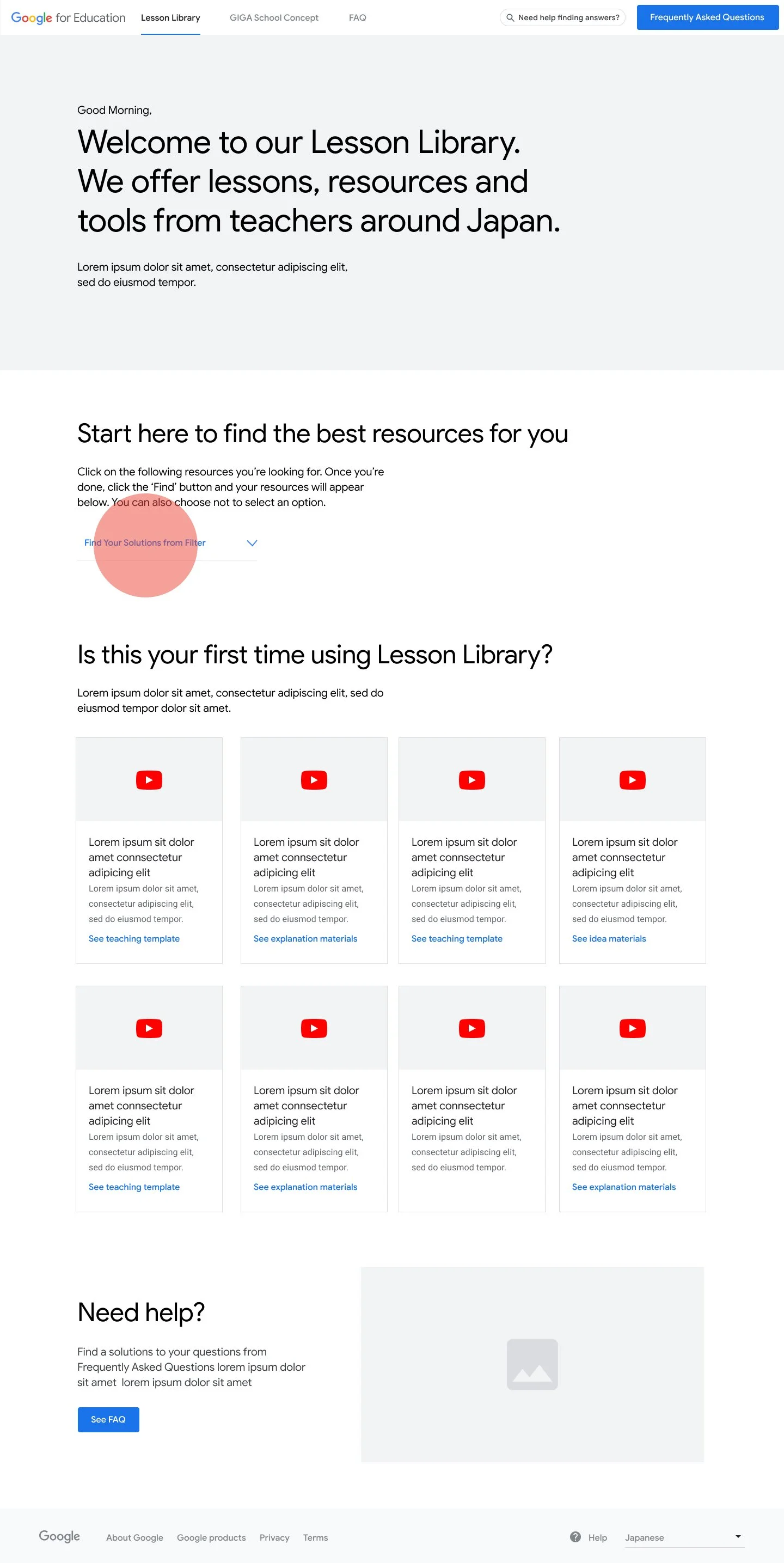
Lesson Library
With lesson library wireframe, I also reached out to the team to further discuss what’s feasible and get a better understanding of the page.
I started off with designing a few hero banner options from video, photography to illustration. I’ve also included a storyboard to show how it animate to give it a bit more personality.
Given this is an online resource page, I preferred the brand illustration version as an option to differentiate from other pages and also give it that visual appeal, something eye-catching enough to keep people scrolling this site.

Then I worked my way down the wireframe. Character count was the next thing I wanted to discuss on as it is copy heavy and unnecessarily pushing the content further down the page. What I wanted to do here was to create a cleaner and more intuitive layout where I’ve changed the 4 column to a 3 column. What this does is it gives us more room to display larger video thumbnail images and allows the user to properly dedicate their time and see whether the video options catches their eye or not. The search filtering above accommodates the design change so nothing is lost.
If and when the user decides to expand on the search, a floating “back to filter” CTA also got added to the page. This CTA will appear and follow the user once they have scrolled past the first row of videos. If clicked it will take the user back up to the filter section, open the filters for the user to adjust. This CTA will only exist within area in which video results appear.
Homepage
Revised

Visual
Video modal

Within the modal the user can also view text related to the video as well as any resource links that go with the video.

Tool tips

Full screen User can watch the video right in the modal or full screen it. If the user exits the full screen it will take them back to the modal